I’m in love with the new Gennev look, feel, and most of all, what the brand represents.
I hope you are too.
Last week we announced the new brand. This week, I’ll share more about why we rebranded.
In 2016 when we launched Gennev, we were so new to the menopause space. We knew plenty of women who were in menopause or had gone through it, but we didn’t know much about how to help women take control of their health on the journey.
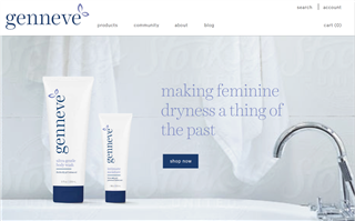
Here’s an image of the very first website that we launched for Gennev.

When we launched, we were all about products. Things have changed.
We selected the name genneve because we wanted something beautiful, feminine, and that represented confident women.
At the same time, we surveyed 1500 of you and quickly learned that there was a lack of trustworthy menopause education for today’s modern woman. So, former educator Shannon Perry joined the company, and we started publishing articles and podcasts that captured our interviews with health providers working in the menopause space.
We quickly developed beautiful packaging for the genneve line of products, put up a website, and we were open for business.
Looking back, I’m so thankful that we thoughtfully hustled our launch into the market. We learned a lot!
I won’t give you the play-by-play of three years of intense learning, but the women of Gennev have given us our MBA in Menopause. During this crash-course, my stepson asked me if the brand genneve represented me as a woman. It didn’t.
I’m a bit more raw, human, and even imperfect. I’m drawn to natural, cellular images, because, we humans (and menopause) are a natural thing.
So, we gathered a group of brand thinkers and launched out to talk to women.
About 50% of the time, people mispronounced genneve. It’s not intuitive, so we tested dropping the final “e,” and voila, pronunciation accuracy shot up to 90%! When you want to be the household name for all things menopause, being able to say the name matters a lot.

We knew that we wanted to be more inclusive of all types of women globally. Menopause is natural, it’s organic, and women wanted to feel that when they connected with Gennev. As a result, we warmed up our color palette and added textures that bring a sense of the cellular changes that are happening in our bodies.

New color palette that brings warmth

New illustrations represent the organic and natural process of change that menopause represents in our bodies.
And finally, the logo. You’ll notice that the logo has a new icon at the end. It’s a conversation bubble.

We believe that managing menopause starts with a conversation. It starts with women talking about it and no longer suffering in silence. So we replaced the flower with a conversation bubble to show that we’re a company of relationships and a place for safe, factual conversation.
In closing, I want to circle back to what Gennev means. (Gen): a new generation of woman, new thinking, finding strength in the tribe”redefining a generation. (nev): from old Irish, Niamh that translates to neve”which means radiant and bright.
Gennev represents the new generation of women who are heading into their most radiant time of life.
We are radiant, and it’s time we claim it.

